
In screenshots, The Girl with the Guitar may look like it’s 2D… but this is a lie! Throughout the game, certain scenes feature differing camera rotation and placement, making it clear that this is, in fact, a 3D game. So, how does it have such a flat, 2D, pixel-art look? Well, let’s take a look below!
Step 1: The Camera
This is a fairly obvious one. In a typical 3D game, the camera utilizes a perspective effect which mimics our vision, with distant objects appearing smaller and closer objects appearing larger. If you are a human, this should be no surprise (if you are an insect, I’m sorry, you will never understand).
This is a problem for a game mimicking a two-dimensional look, because it means that our “sprites” will morph and expand and contract near the edges of the screen. In some cases, this could be desired and look cool with a pixel aesthetic (as in A Short Hike), but for us, it’s just going to make the action much harder to gauge.
Thus, we’ll use an orthographic camera, which doesn’t transform to perspective. This way, an object is always the same size no matter how close or far it is from the camera. Importantly, the objects in the 3D world are still placed above and behind one another, it’s just that the camera can’t see it. This will come in handy later.
Step 2: The Physics
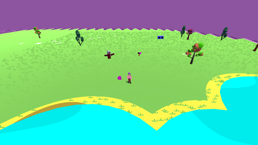
Here’s where things get a bit weird. To solve Step 1, we use an orthographic camera. In this case, we rotated it -30 degrees about the x-axis, meaning that it’s tilted forwards by 30 degrees. This achieves a top-down look similar to that of isometric games like Hades, where we can see the full range of characters’ movement from a side angle without just positioning the camera from a boring birds-eye view straight above.
But there’s a problem! When we position the camera at an angle, movement is warped. Remember that everything stays the same size on screen. When Eve (the main character) moves to the right or left, the camera follows exactly and we can clearly see movement. But when Eve moves forwards or backwards, she’s actually moving at a 60-degree angle to the camera rather than parallel to it.
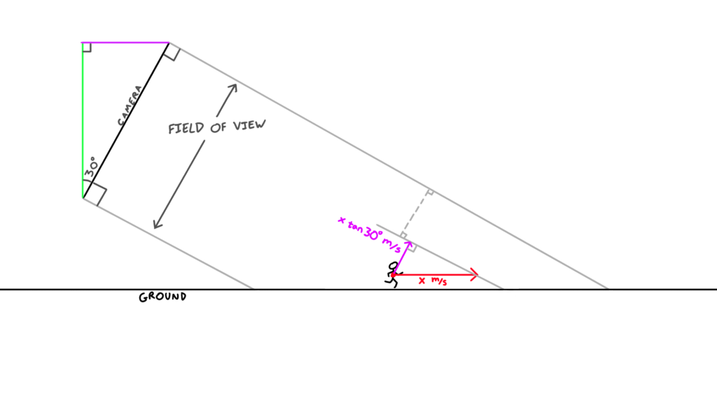
Fortunately, this is nothing a little calculus can’t solve. Considering velocity and displacement, we can do some quick calculations and see that our problems will be fixed if we multiply front/back movement by cot(x), where x is our angle – in this case, that comes out as cot(30), also known as sqrt(3), or about 1.732. If we multiply the player’s front/back movement (aka their z velocity), our front/back movement will look just as fast as our left/right movement.
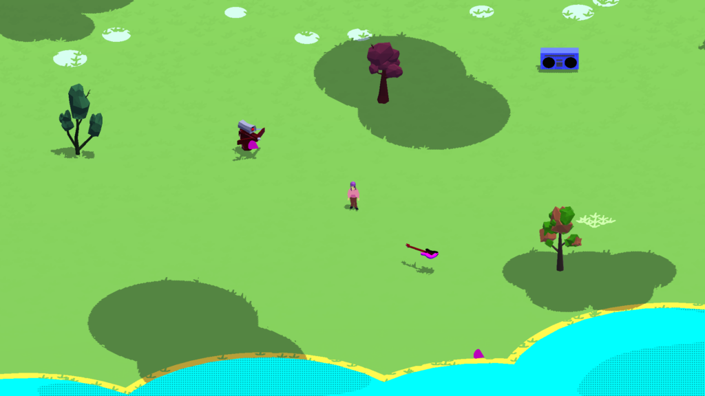
Now, Eve isn’t the only thing in movement – that’d make for a pretty boring action game. So, we also need to multiply the z velocity of EVERYTHING that moves by a coefficient of 1.732. This isn’t really all that hard, though, as we can just store it as a constant.
Voila! Now we’ve got something that looks essentially like a Supergiant game, with our crisp 3D models made to look 2D. But that’s not quite the look we’re going for, so let’s keep going.
Step 3: Pixels!
This one is really, really easy. All we need to do is downscale the resolution of the viewport. In this case, we downscale the viewport by a factor of 3, leaving us with a 640×360 pixel screen:

We could have used a shader to do the pixelation, but this isn’t only inefficient for us, it’s also inefficient for the game, as we’d be asking our screenspace shader to run over nine times as many pixels (3×3=9).
The pixelation, however, exposes a larger problem…
Step 4: Colors
When you take a typical HD image captured by a camera and pixelate it, it just looks low-res and, well… bad. Why is this?
Pixel art is an art style which is dependent on having lots of contrast. Not only was this a limitation of the Atari, NES, and arcade days (when you only had a limited color palette anyways)… it also just looks plain bad if you try and do a direct gradient in pixel art, because you can see all these big chunky squares when it’s supposed to be smoothly transitioning between hues.
When we pixelate the game, the lighting performs a gradient on most of our textures, which makes them look terrible due to the pixelation.
To solve this, we have a few options.
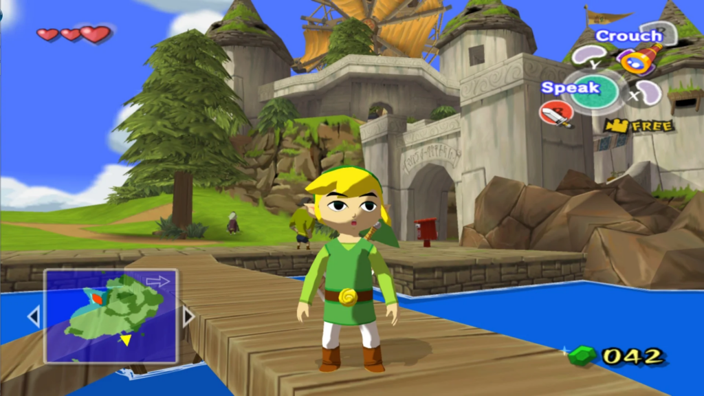
For one, we could alter the lighting itself so that the gradient is less pronounced and/or nonexistent. One of the most famous examples of this is The Wind Waker, a game which primarily uses a lighting smoothstep to achieve its iconic cartoon style:
Another option is to use a screenspace shader to simply lock every pixel on the screen to a specific color in a palette. We could do this by comparing each pixel’s distance (in colorspace) to each color in the palette, or we could use grayscale for a more unpredictable (but sometimes cooler) effect, achieved by averaging the RGB values and then flooring them.
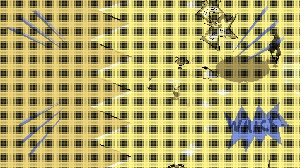
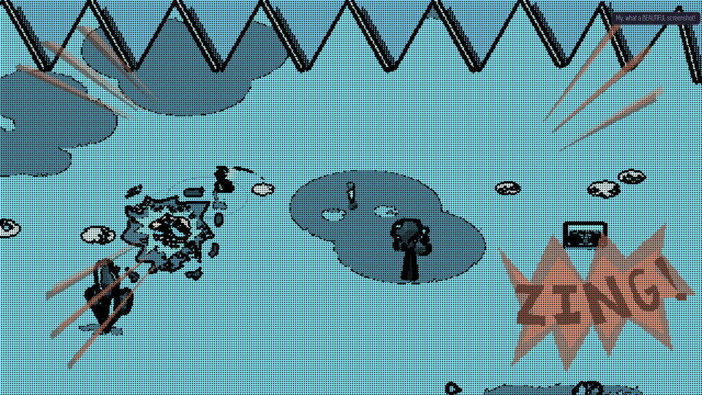
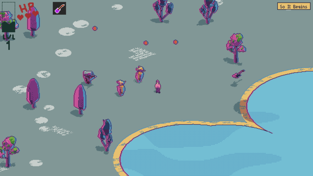
The Girl with the Guitar uses the screenspace shader option, mostly because it allows for more versatility with effects. For instance, when the guitar destroys a robot, the screen shader switches to a paletted grayscale effect, which helps stylize the combat of the game:
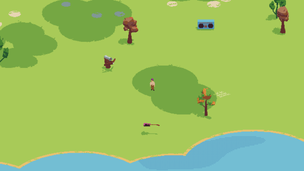
During general gameplay, we can instead use distance checks with a color palette:
It should be noted that this effect could potentially perform worse if code is unoptimized, so it’s important to use distanceSquared() rather than distance(), limit your color palette, etc. I’ve been testing on a pretty old laptop with integrated graphics and I’ve got everything working fine, so it shouldn’t be a problem, but it’s something to look out for nevertheless.
And with that, we have a pretty nice looking pixelated toon look to our game! But there are a few more touches we can make.
Step 5: Outline
This step is completely optional. As of step 4, we’ve got some neat Hyper Light Drifter-style pixel art, with no outlines resulting in a softer look to each frame’s composition. But The Girl with the Guitar isn’t soft, it’s loud! So let’s go and add an outline to make the shapes more distinct to better fit the style of the game.
The easiest way to make an outline will be to sample the depth buffer. As I said at the end of Step 1, the game may look two-dimensional, but all the depth between the objects is still there.
The depth buffer simply gives us each visible pixel’s distance from the camera. A really easy solution to make an outline is simply to compare the depth of two adjacent pixels, and if the difference between the two is above a certain magic number threshold, we’ll draw a dark pixel outline on one of the pixels:

This strategy also allows us to do some fun effects by replacing ALL non-outlined pixels:
That’s the “clean” way to do it. There’s another “messy” way to do outlines, which results in a really cool (albeit noisy and unpredictable) effect in its own right.
All we need to do is take our screenspace shader and add a function which compares not the depth but the color of two adjacent pixels, and if the two colors are more distant than another magic number (again, distance measured in RGB color space), we’ll draw a black outline on one of the pixels.
This would be a crazy effect to use permanently, but it’s really cool in small flashes. So, in The Girl with the Guitar, like the grayscale shading, I use this “messy” style of shading during the guitar-smash robot death effect. Notice how the line texture is jagged and noisy:
We’re more or less done, but there is one more effect we could add.
Step 6: Highlights
Some pieces of media like to use a technique called “chromatic aberration.” It’s the effect where objects’ colors are displaced so that they have a red and blue copy on either side, sort of like bad 3D glasses.
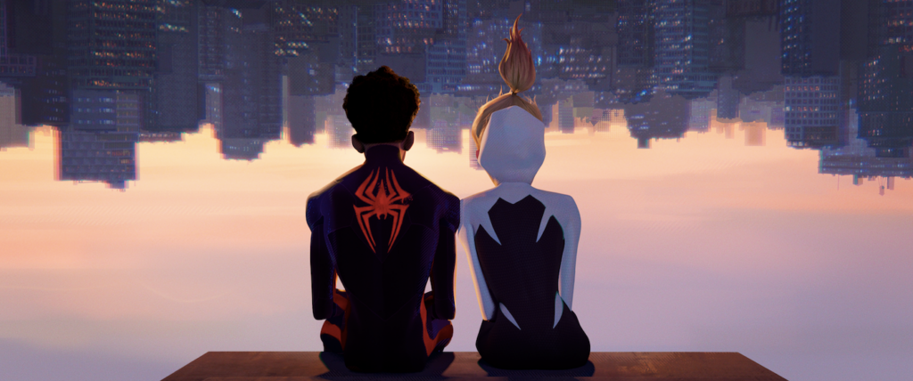
Often, big-budget games use this as a headache-inducing effect for seemingly no reason, but when it’s used stylistically and purposefully, it can actually look good. A perfect example of this is in the Spiderverse movies, where it’s used to replicate comic book printing errors and it’s used sparingly, only in the backgrounds, to actually call attention to the characters in the foreground.
In this case, we can use this sort of chromatic aberration as a stylistic highlight around the edges of objects, not as a headache-inducing color displacement but as an additional splotch of color here and there. We can make it take up entire pixels in our magnified pixel art view, which makes it look much more purposeful and allows the viewer’s brain to actually recognize it as a color rather than a weird offshoot of the object.
Implementing this effect is very easy. All we need to do is use the same shader as we used for the depth buffer outline, but this time, we’ll displace it to the left and right, add red and blue accordingly, and change the size of the outline.
(Of course, this, like many other aspects of the game’s visuals, can be turned off at the user’s command.)
Conclusion
That’s a wrap on The Girl with the Guitar’s visual style! But I suppose there’s one more question to ask: why use 3D at all?
First of all, the 3D graphics allow us to rotate the camera in cool ways, making cutscenes a breeze. It also makes development flexible – for example, there’s a section in the game where the camera turns to a sidescrolling view, which was visually easy as pie given that I mostly just needed to rotate the camera (physics programming aside).
But, more than that, this greatly helps with the process and style. It is extremely time-consuming to draw and animate everything in a game, but 3D models make this process much easier. 3D animation can be done in ways which are easy to edit and visualize, and in turn this actually changes the style of the game. Think about 3D animated movies – sure, when all’s rendered and done, they’re in two dimensions. But due to the different process with animating in 3D, the movies come out looking completely different than their 2D counterparts (or, in the case of Spiderverse/Mitchells/TMNT/etc, they are able to do all sorts of unique effects which would be nigh-impossible in 2D development).
Most importantly, I just like 3D modeling. It’s fun, and it lets you do all kinds of crazy shader magic!
And that’s about all there is to it. Thank you for reading!